“Design a pendant light for RBW that uses spun metal and glass” – Lighting, Accessories, and Housewares
How can I emphasize contrast in a spun-metal pendant light for RBW?
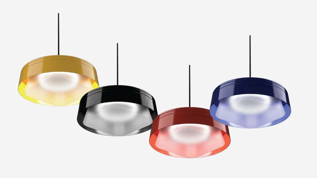
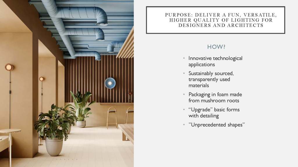
RBW is a modern lighting company that caters to architects and designers. For this client project for the Lighting, Accessories, and Housewares class, the brief called for a spun metal pendant light in three sizes. My approach drew on RBW’s minimal design language and stripped the concept back to the principle of contrast. The focus allowed me to explore variations in shape and emphasize the juxtaposition of the linear and the circular. The final designs are self-referential and adhere to RBW’s language.
Crystal Concept
Research
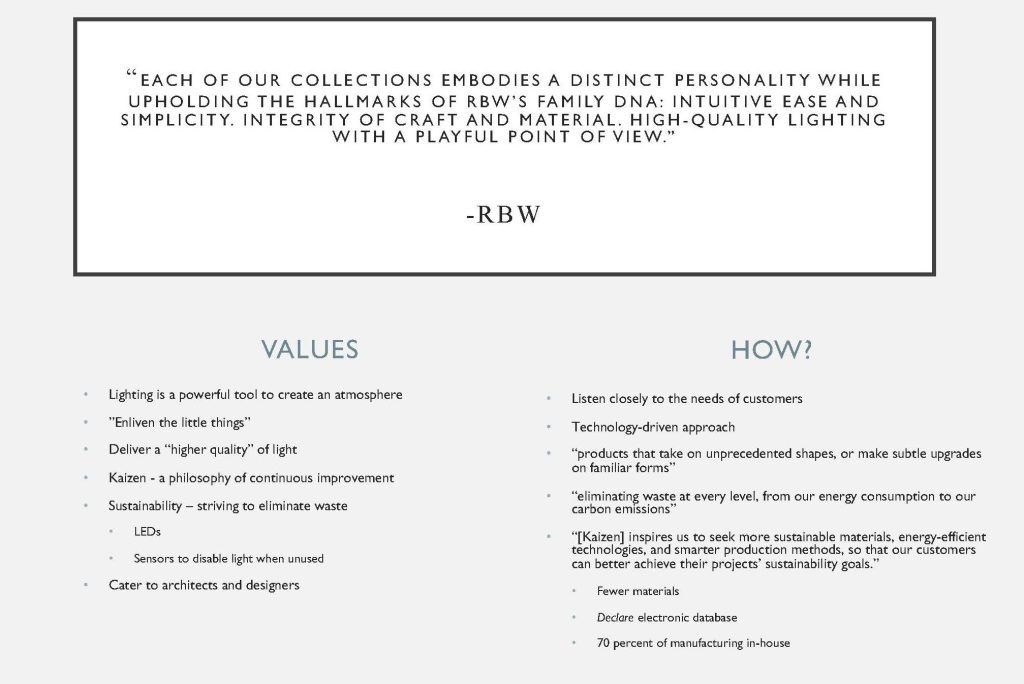
RBW is a brand that focuses on attention to detail and life in the little things. Unprecedented shapes and a culture of improvement drive RBW to create new and innovative lighting solutions.
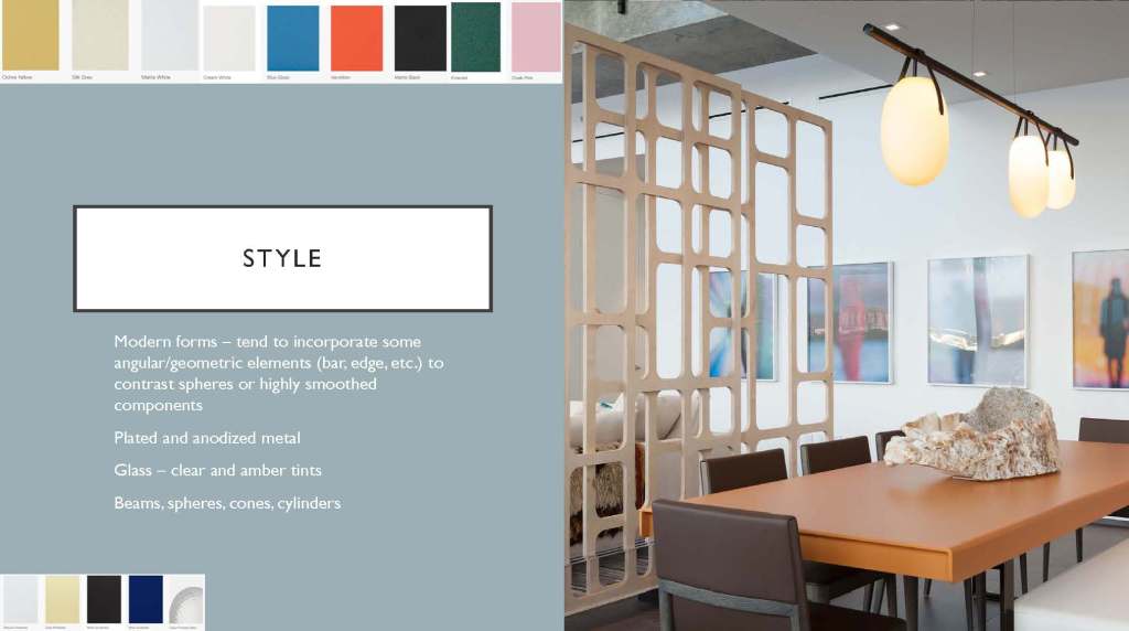
A blend of softness and rigidity is key to the RBW aesthetic. Lights are warm and diffuse, colors are fun, and balance is variable. Some things are symmetrical, others allow for asymmetry. RBW is startup-casual. There is a sense of dignity, but they aren’t afraid to have fun.
Current Brand Offerings
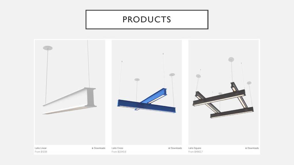
Beam form examples
Range – pendants, sconces, beams, overhead
Flexibility – rigid forms and loose corded forms. Almost always a combination of the two. A light source can be completely diffuse or allow for a level of visibility, like the green example in the upper left.
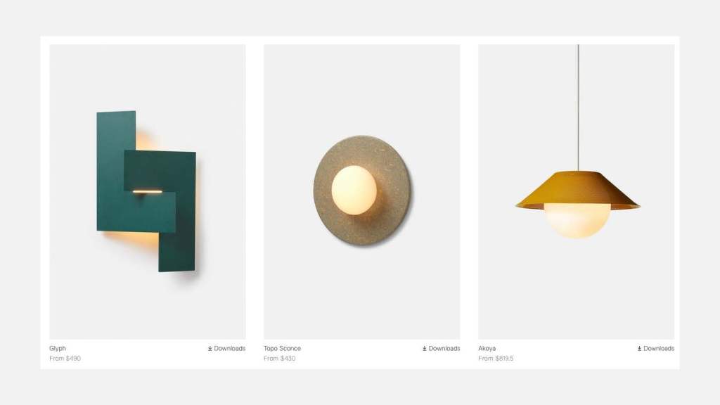
This image shows a sheet form, sconce, and pendant. The sheet form on the left (Glyph) is about as flat and minimal as RBW gets, and it highlights their idea of enlivening the little things. For this project, I wanted to create a moment of reveal similar to the Glyph, where the interaction with the viewer is distinct and based upon the interaction of light with the base form. In the Glyph, it’s the blocking of the dispersed (light) with the rigid plane; there’s a contrast between the nature of the materials.
User
The RBW user is design-conscious and willing to pay for an enduring product. A separation does exist between the commercial and residential markets, but RBW does cater to both.
The installation should be easy – the users value it. The users also enjoy the moments that RBW fixtures create. They purchase because of the life the products bring into their spaces. The final quote describes a customer who left a review before installation! RBW lights make people feel connected to their purchase – even though it’s expensive, people are happy to spend the money. I knew at this point that the light needed to stand for something on its own. Beyond an addition to the product line, the light needed to have a story – something for the user to discover.
Competitor Benchmarking
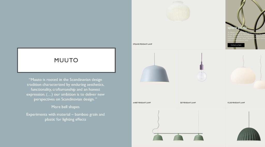
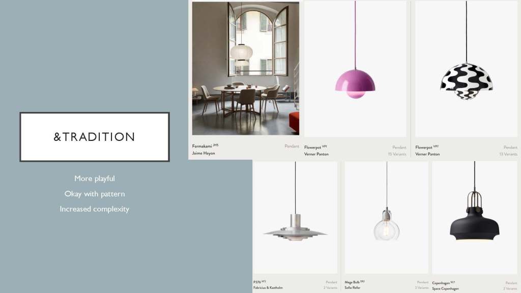
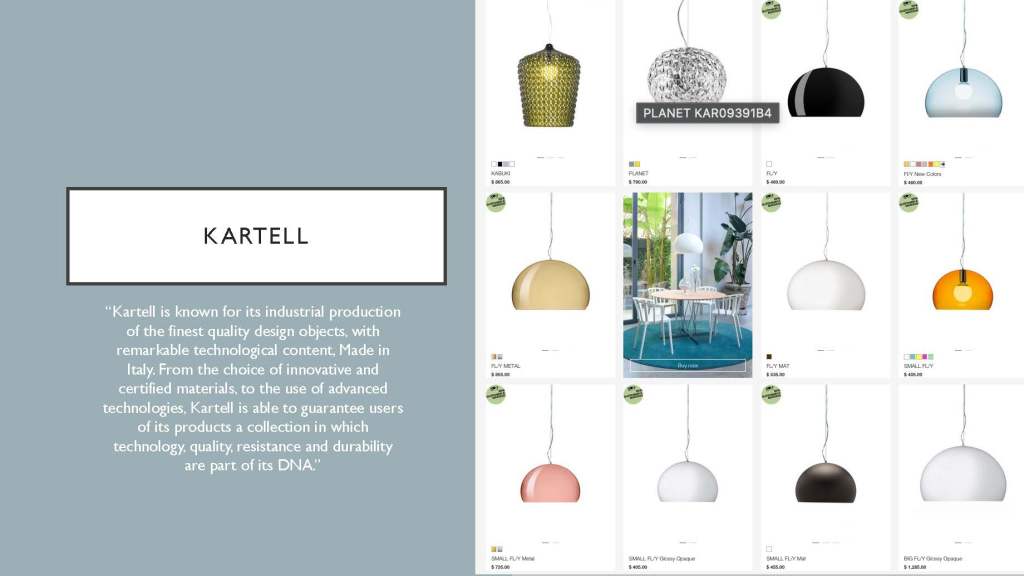
Three competitors are shown above. In high-end lighting, they share DNA. The brands all have their own skew. Muuto is restrained and Scandinavian with muted colors. &Tradition likes to get more playful, frequently using patterns and stacked forms to define their lineup. Kartell really likes modified spheroids. This benchmarking was useful to define RBW’s language a bit more. Venturing too far in any of these directions loses the tightness of RBW’s style.
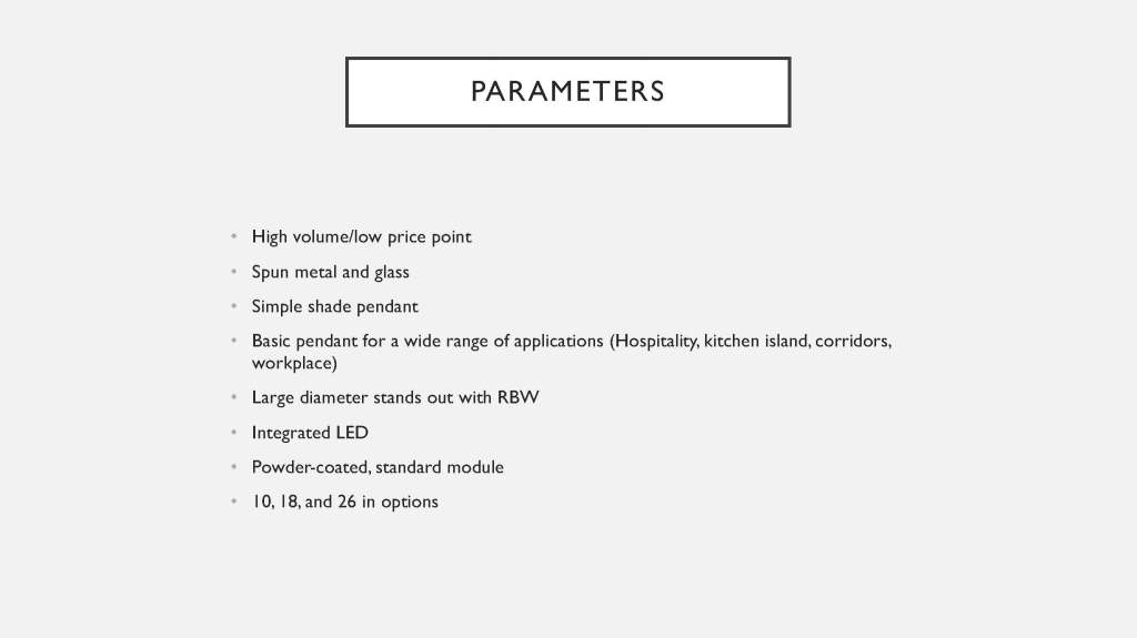
Design Criteria
Ideation
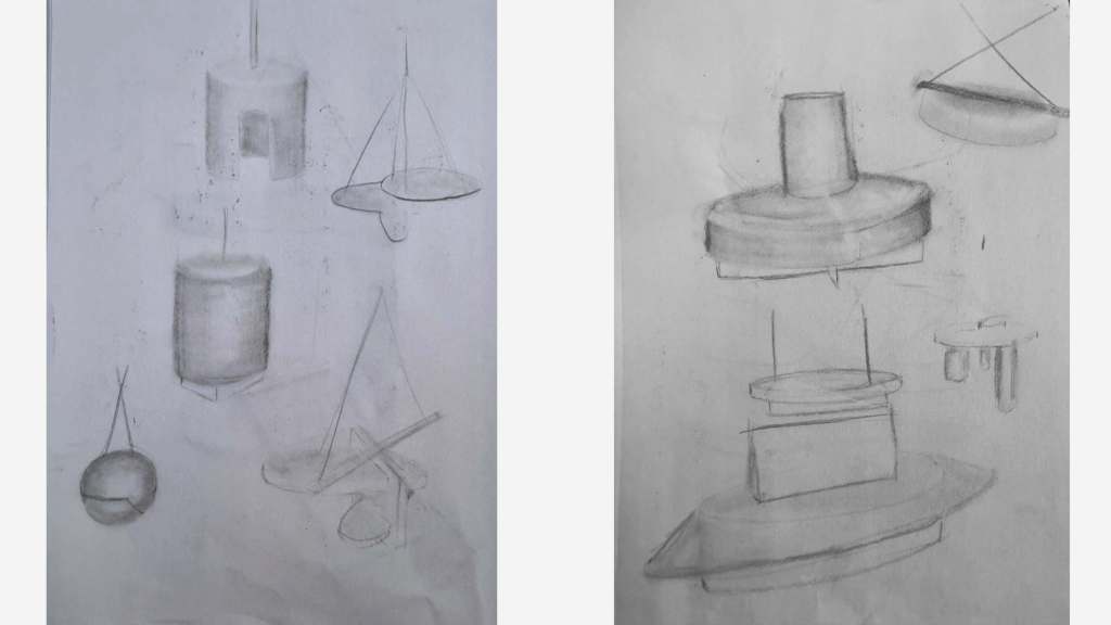
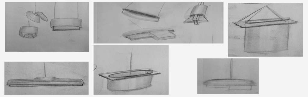
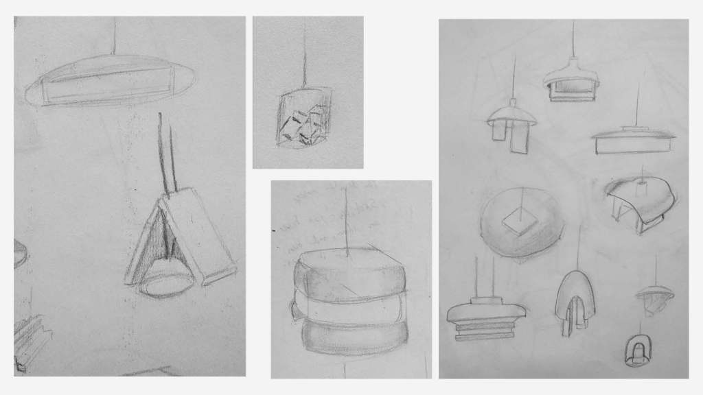
All of these sketches were based on form and shape contrast. Nearly every concept is a linear form with curved accents or vice versa. Both cutouts and extrusions were explored, but extrusions tended to develop more interestingly. The extruded forms offer a three-dimensional contrast, as compared to a surface treatment that emphasises shape. For this reason, I chose to move forward with three concepts involving extrusions.
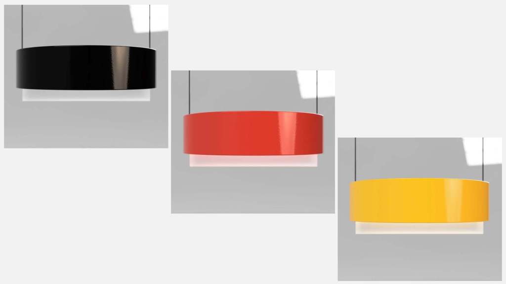
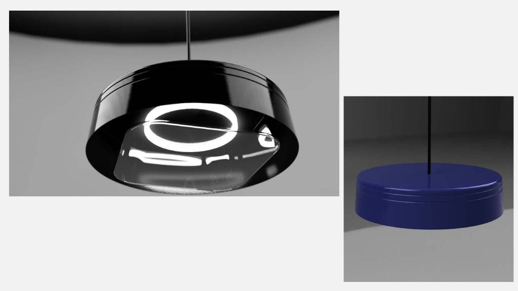
Concept Renders
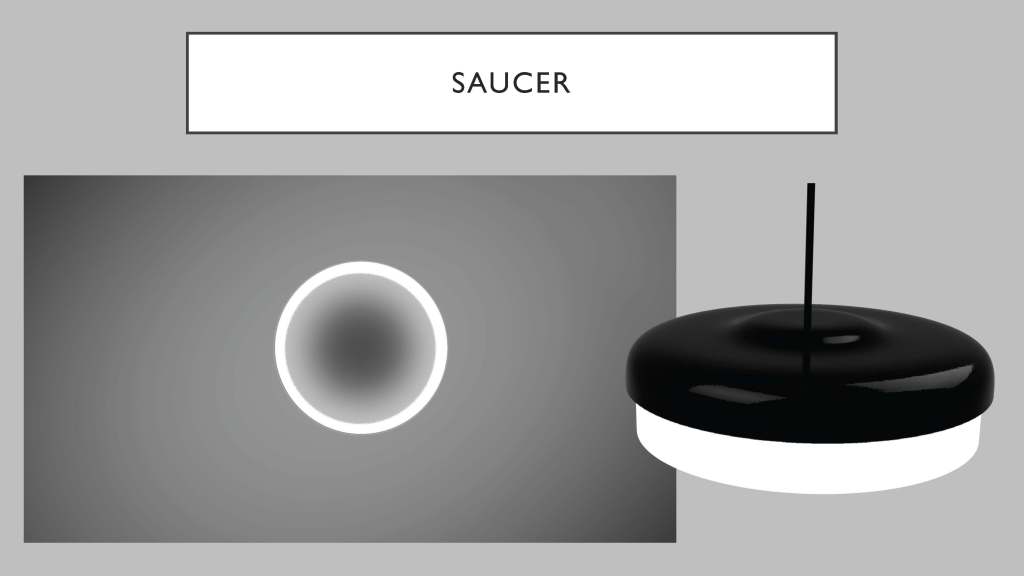
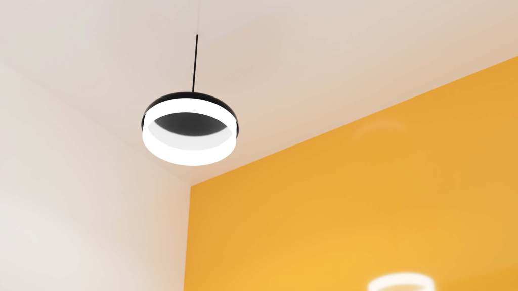
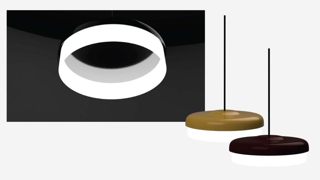
Saucer combines a spun dish with a glass ring, finished with a square edge. The circular ring creates negative space in the middle of the fixture while giving the light a rigid volume to occupy.
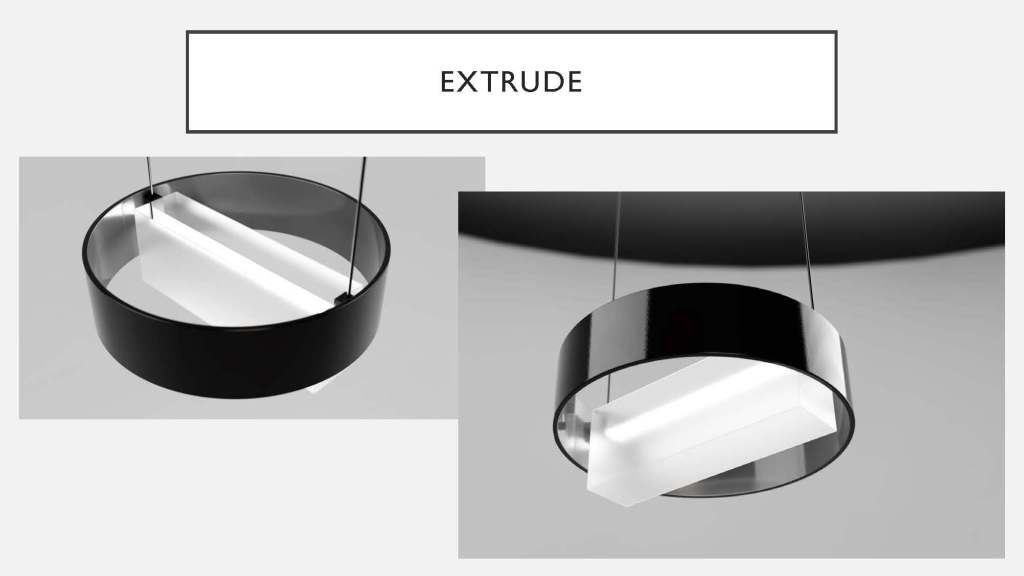
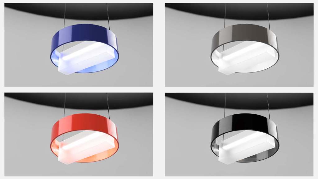
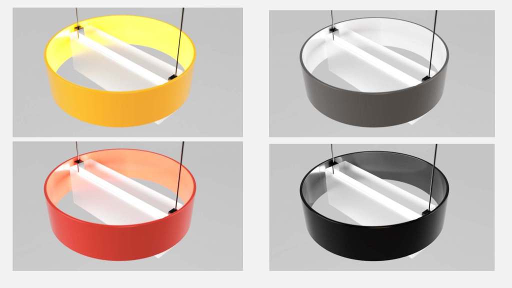
Extrude projects light through a 5-sided rectangular prism, nestled within a spun metal ring. This contrast is between the box form and the outer ring.
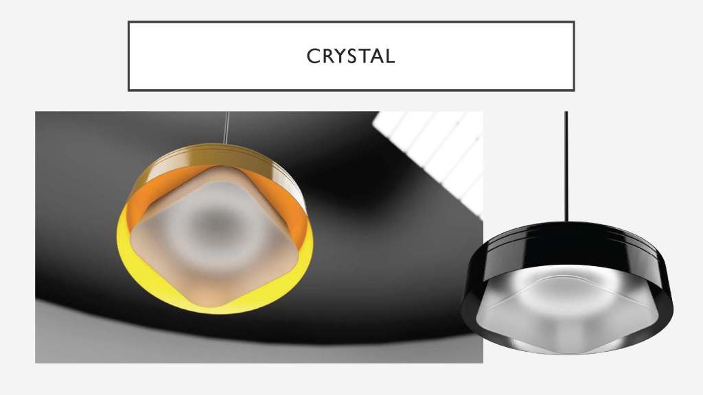
Crystal is my favorite iteration. This concept features a multi-layered reference. Where the glass contains both large radii and a generally square shape, the LED light and spun metal housing remain circular. In Crystal, there’s a moment where the layering is clear, and the relationship between the components is highlighted – each delineated by form into its function. The shapes separate their tasks visually, but references tie them together. In the renders above, the glass is shown both transparent and frosted.
Prototyping Process
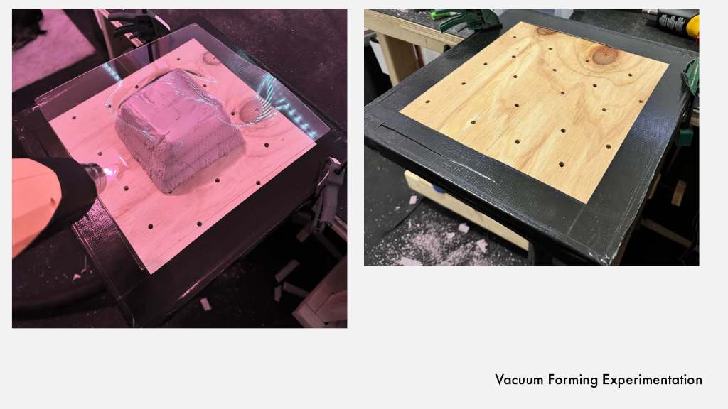
For this project, I decided to try my hand at making a quick vacuum form table at home to experiment with the glass prototype. Run-and-gunning, there were only a few short minutes between idea and conception – my shop vac was not nearly strong enough for an effective vac form. To combat this, I tried printing some forms to assist in molding the ‘glass’ (shown below).
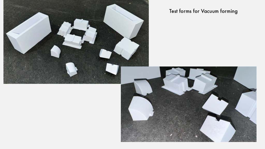
The second mold test failed; the heating was too uneven to get a good result at home. I moved to a different method (3D printing) to create the structure of the glass.
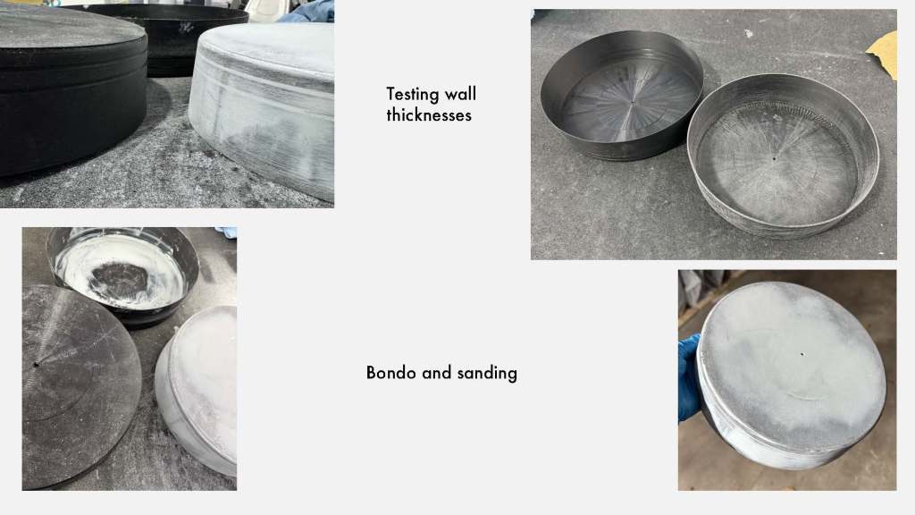
The original plan was to modify a metal bowl for this prototype, but the bowl that arrived did not meet the specifications of the description. So, to improvise for project deadlines, I 3D printed a few versions of different thicknesses to see what looked best. I selected a version and moved forward, preparing it for paint.
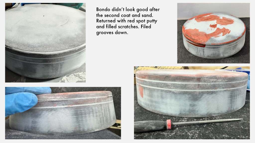
Here are a few detail shots of some early Bondo work. Most of the layer lines were filling in nicely, but there were clearly still many visible imperfections. I got in with a file and cleaned out the accent ridges to restore some detail.
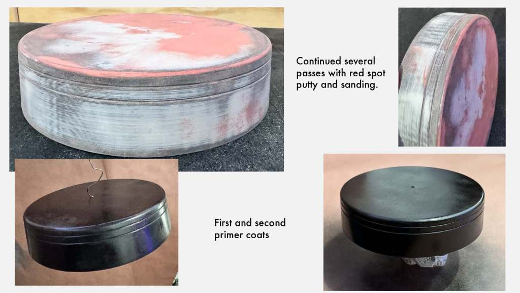
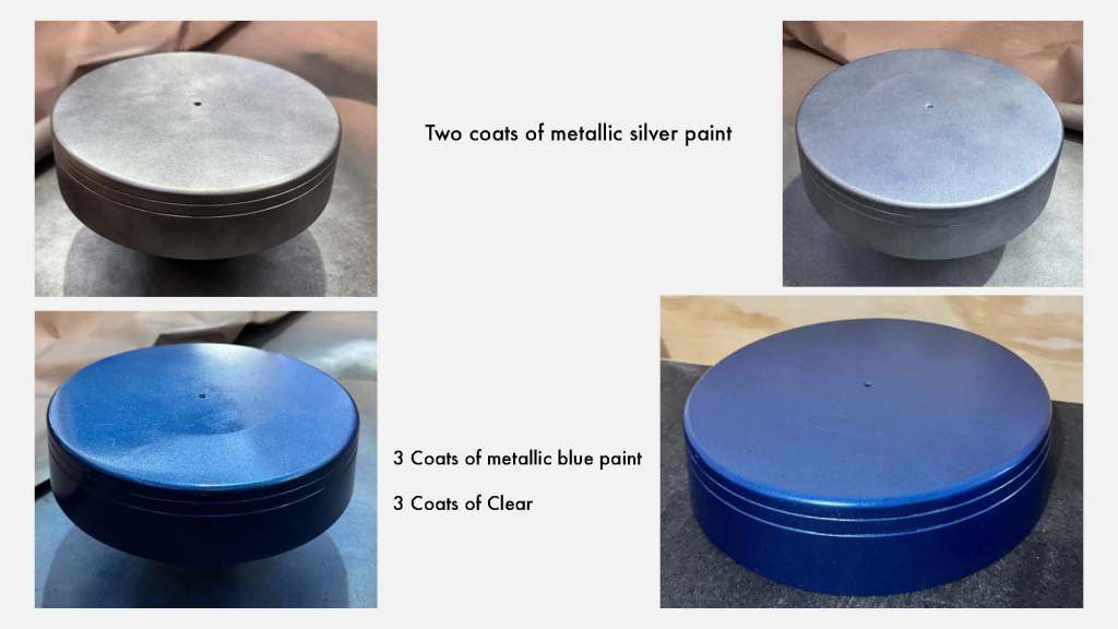
After a few more layers of spot putty and sanding, I moved on to the primer. From there, I added layers of metallic silver and blue paints, followed by a clear coat.
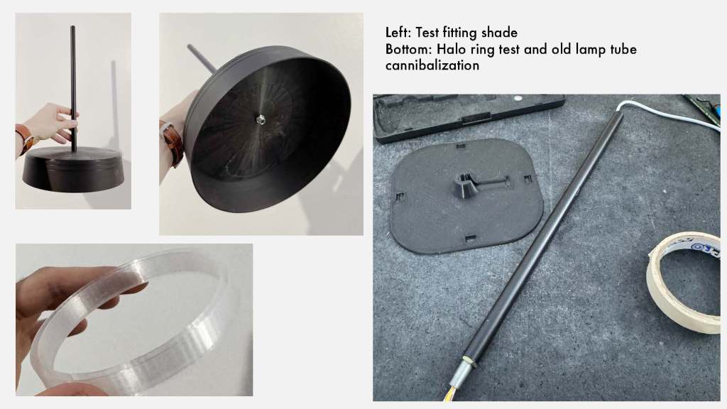
The images on the left show a tube from an old lamp repurposed as the shaft for the pendant. The bottom left shows the LED cover. On the right, the LED strip is test-fitted through the tube. To the tube’s left, a mounting plate for the glass shade is shown.
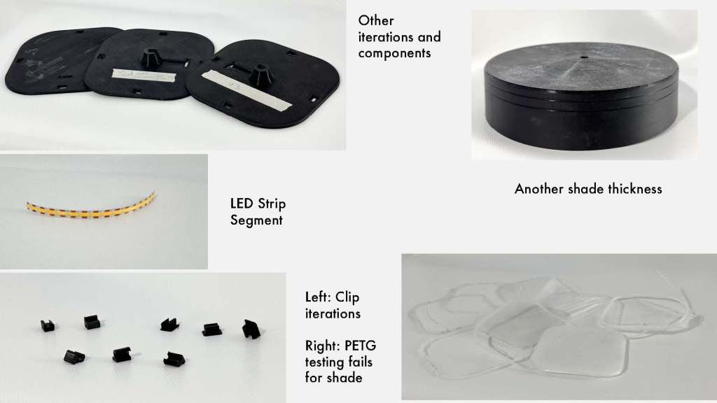
I experimented with several different plastics for the glass shade prototype. Transparent PLA worked the best. PETG is shown in the bottom-right in an image depicting infill tests for clarity. To the bottom-left, iterations of the glass clips are shown. The clips insert through the top plate (top-left) to latch onto the shade from the inside. The middle-left shows a segment of the LED strip. It’s continuous, so no segments are visible in the strip. The solid bar of light defines the circular path of the LEDs.
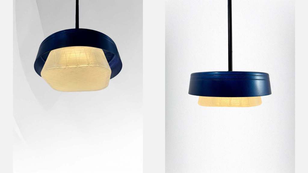
Physical Prototype
Reflection
At the end of this project, I found myself with a good list of refinements for the next version. The glass needs to be molded in the final material. The clips should also be accessible from the back and integrated into the top plate differently. I would also adjust the proportions of the smaller sizes. For this project, all three sizes shared the same proportions, which leads to a bit of a disconnect between the renders (shown at 26 inches in diameter) and the prototype (10 inches). The contrast effect was noticeable, but not as much as I would like. There should be more exploration of glass molding and LED options.
