“Design a 20x20x20 ft. trade show booth” – Environment and Retail Design
How can a gallery-like experience be created at a trade show to emphasize the possibilities of Bosch tools?
Bosch is a multinational corporation with many facets. For this project, I focused on their power tools division and created a trade show booth to highlight both the strength of Bosch tools and the finesse that goes into making and using them. By positioning the power tools within the context of art-making, the intent is to create a conversation about the spaces these tools are used in, while simultaneously displaying a high level of craft.

Objectives
- Establish Bosch Power Tools as a brand that can deliver for creatives
- Demonstrate the value of high-quality tools to artists and tradespeople
- Highlight new tool offerings geared towards sculptors and artisans
- Align the Bosch brand with bold expression and innovation
- Create a gallery-like experience in a trade show booth setting
Requirements
- Emphasize the material and textural qualities of concrete
- Show new products
- Use a minimal form language to convey precision
- Use accent colors to provide artistic quality and relief from overwhelming concrete
- Display an object that effectively merges the idea of refined, handheld machinery with the delicate touch and sensitivity of fine art
- Confine the booth volume to a twenty-foot cube
Rationale
A trade show booth for a company in the power tool industry is typically focused on displaying the largest variety of tools possible. What if, instead, the viewer considered the immense possibilities that exist with just a few Bosch tools?
Through creating a gallery-like experience within a power tool booth, the Bosch brand can set itself apart as a tool company that values a fine touch in the development and use of its tools and encourages its customers to do the same.
Demographic Research
Brand Identity
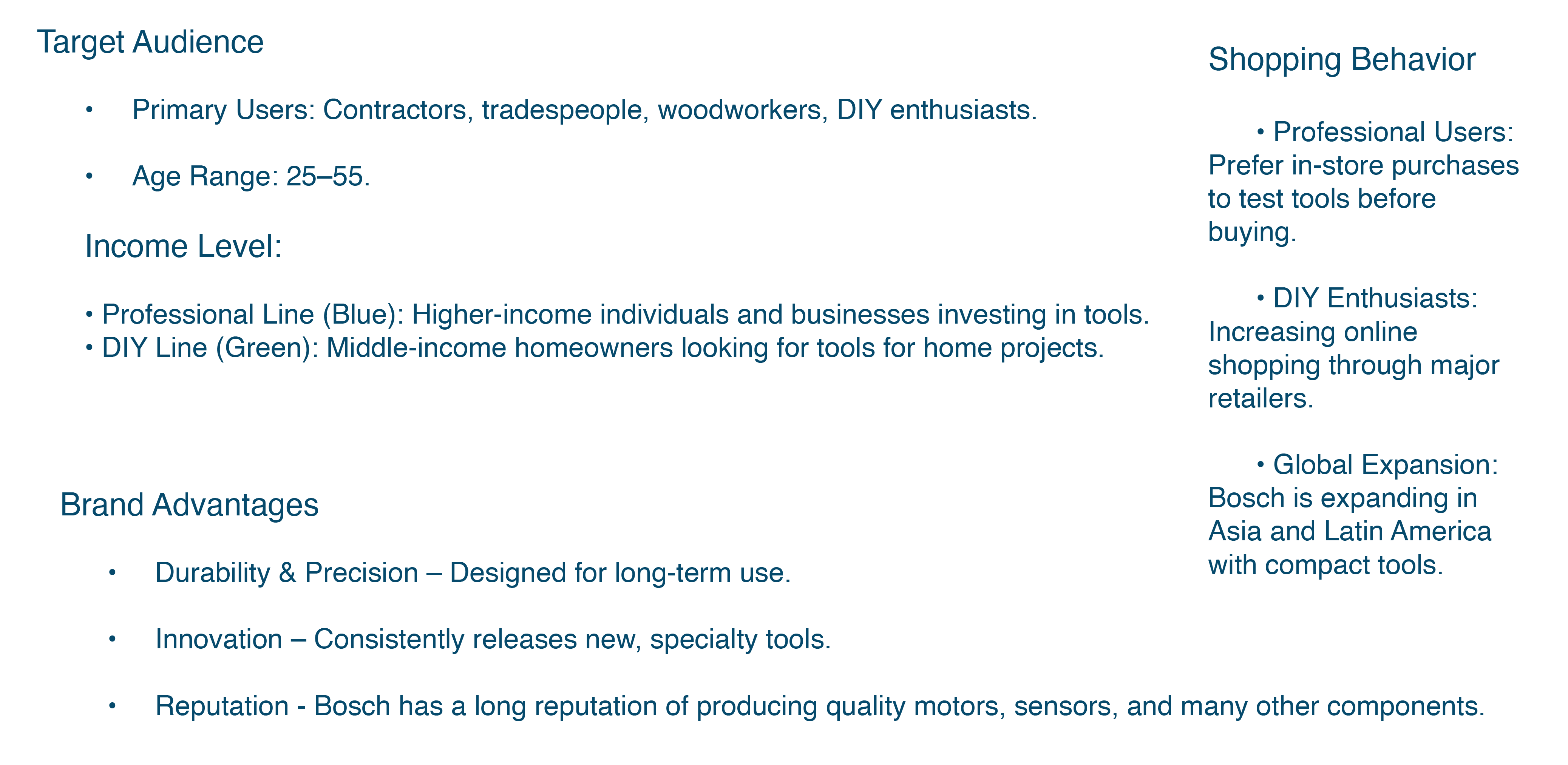
Typical material palette of injection-molded plastic and rubber. Metal and wood will occasionally be used in trade show booths. Concrete is very commonly pictured in advertising. In advertising featuring a face, the figure is generally depicted in black and white. Green is far less common, even though it is another popular tool range. Blue is the flagship and go-to choice.
Concrete became central to this project because of its frequent inclusion in Bosch advertising as well as its symbolism. Concrete as a material for the booth reinforces ideas of designed dependability and strength, which are core to the Bosch brand.
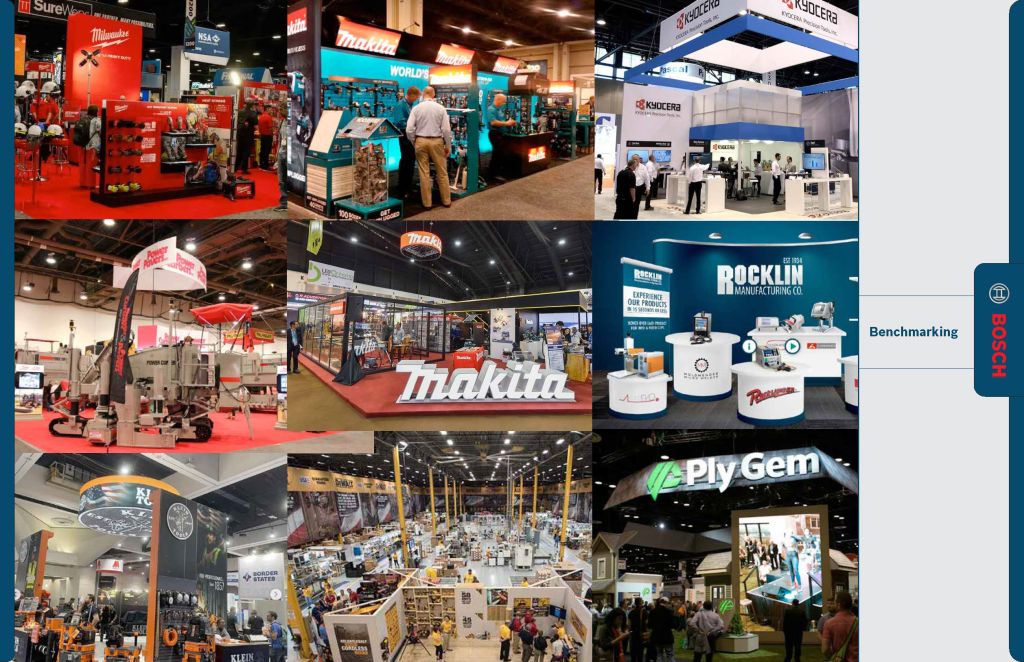
Many trade show booths for tool manufacturers focus on highlighting all the new additions to their respective product lines. This is certainly important, but it provides the opportunity to stand out by taking an alternative approach. A minimal approach would focus on representing a few tools in a more comprehensive way, or changing the typical experience altogether.
This is where the idea of positioning Bosch as an alliance to the arts arises. It’s not necessarily about excluding the hard work of R&D; an impactful experience can make a customer for life. The booth functions as a setting for a conversation about trade and art, where power tools are the mediator.
Ideation
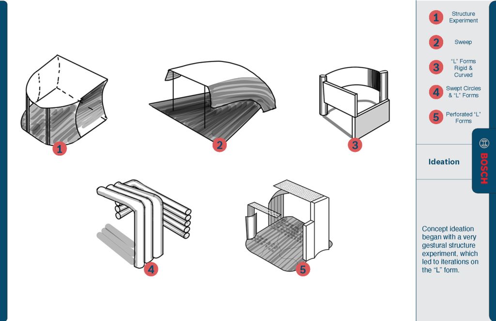
Ideation was focused on iterations of an “L” form. The proportions of the L form mean that parts are always encompassing or overhanging, depending on orientation. Thus, it was a good choice for the booth, which benefits from the ‘surrounding’ qualities. Sculptural arrangements were preferred; the rhythm and expressive forms are key to representing the artist’s design impact on the booth. All of the ideas were focused on creating an impactful sense of scale and balance. Bosch’s control over material and execution should be reinforced through the physical control over the massive forms of the booth – to construct and suspend such large forms elegantly requires engineering and vision.
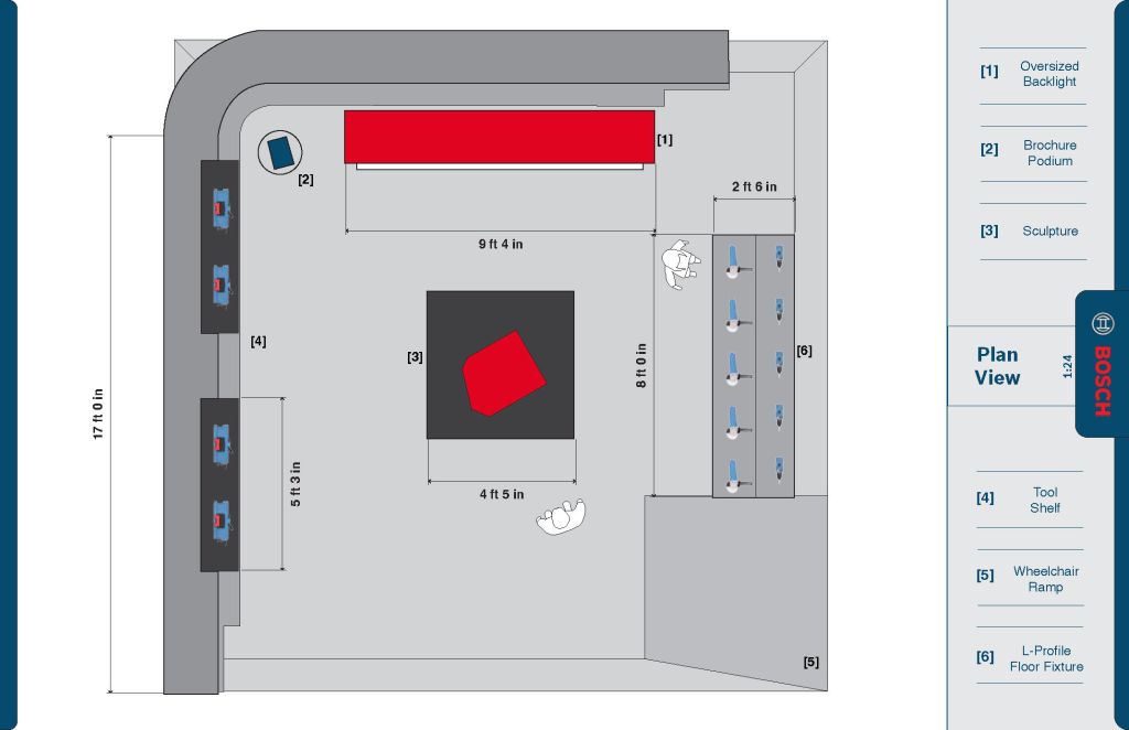
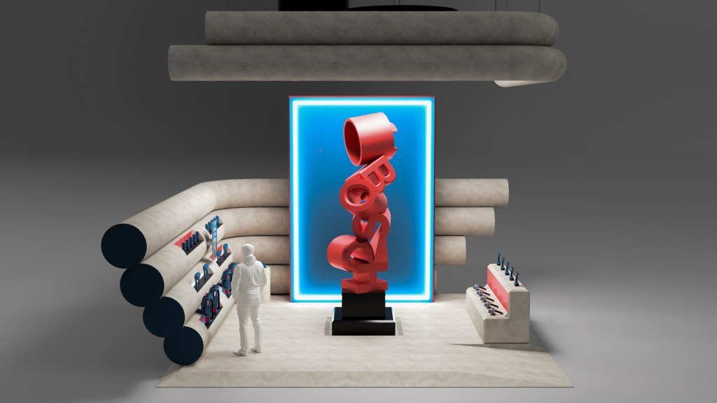
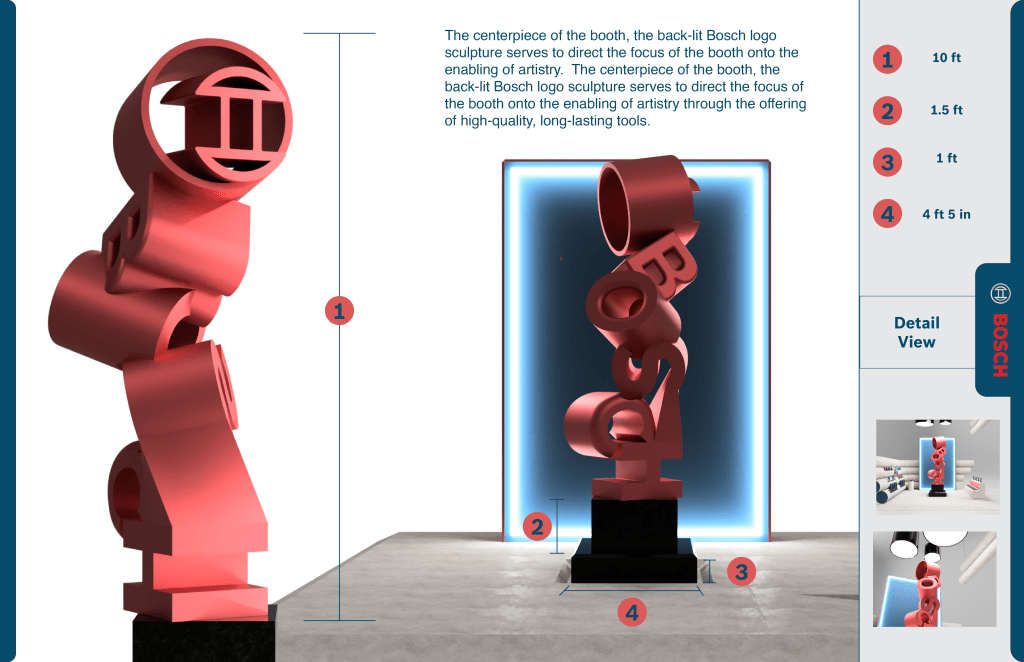
From the perspective sketches, a plan view was developed to work out how the booth would actually operate. The focal point of the booth is a large sculpture, ideally created by a real artist with Bosch tools. To the left, shelves are created as cutouts in the cylinders, which form the walls. The ‘top’ of the image, or the back wall, serves as a backlight for the sculpture, providing a backdrop. The backlight enables the sculpture to stand out on a crowded expo floor, as it frames and lights the centerpiece.
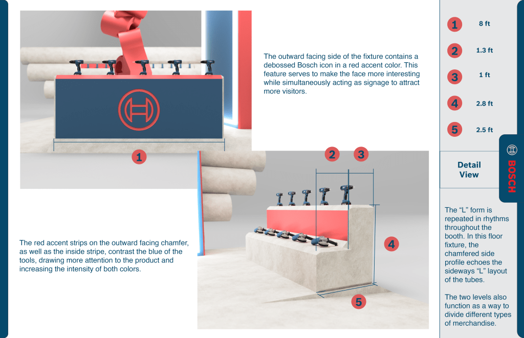
The right side displays an L-profile floor fixture, designed to balance the cylinders’ circularity and provide additional opportunities for product placement. To the bottom right, the floor slopes to a wheelchair accessible grade.
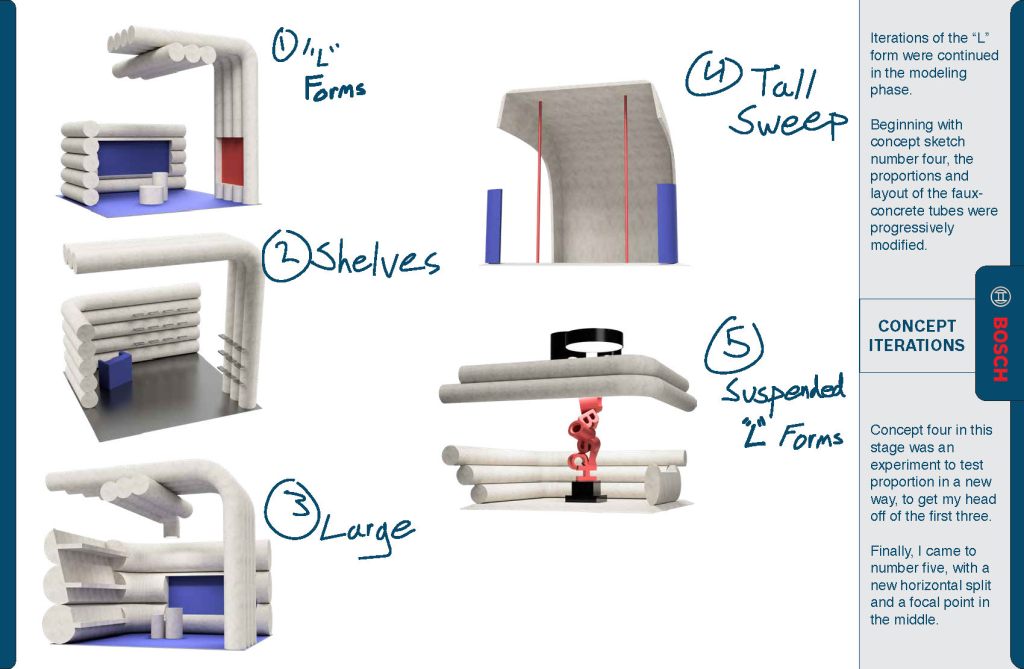
There was a focus on the bent cylinders – the form is inspired by architectural elements of the city, particularly the highway overpass. The associations with stability and longevity are beneficial to the Bosch brand, as those qualities are desirable in the power tools they offer. In the iterations, the focus was on creating a layout of the cylindrical ‘L’ forms with a clear focal point and a sense of lightness (to accentuate the delicate touch of the crafter).
Developed Renders
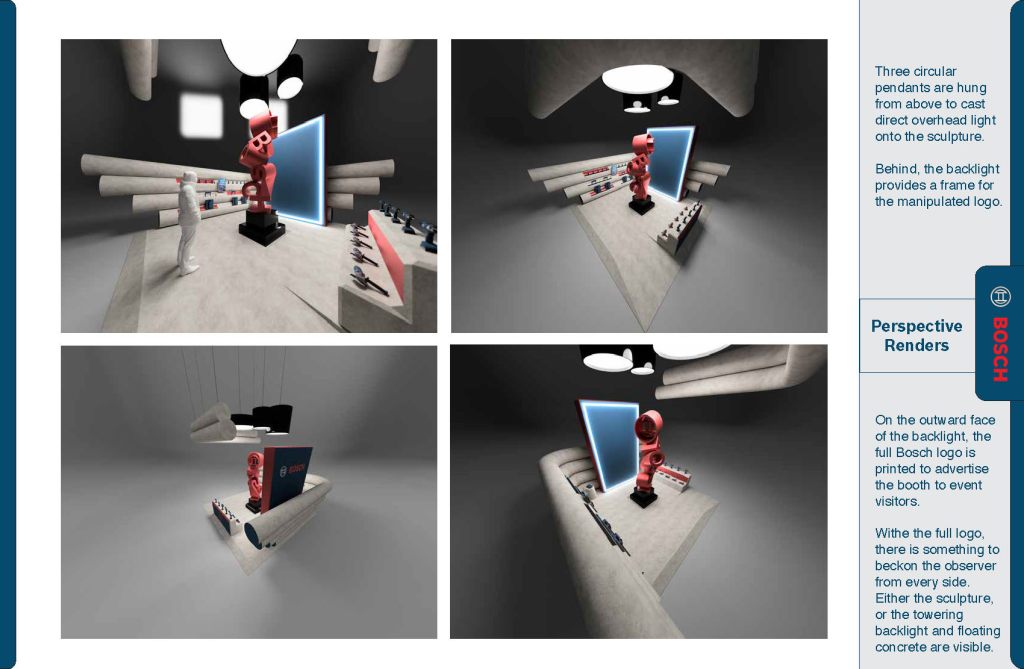
Cylindrical pendants offset the angularity of the platform and backlight, as well as providing a downlight for the sculpture.
Throughout the booth, branding is oriented in multiple ways. The sculpture is recognizable as the Bosch logo from a distance. The outer faces of the backlight and the ‘L’ floor display both display Bosch branding, which acts as an advertisement for the booth on the show floor, where visitors may approach from several directions.
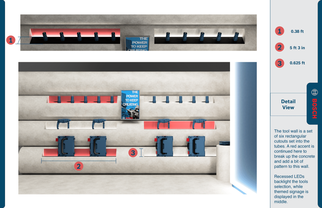
In this last detail view, the other display shelves are shown. They feature a recessed, diffuse backlight set against alternating red accents. Near the right, a brochure pedestal is situated between the backlight and the wall display. This shot also features a custom poster, themed to match the booth. The graphic reads “the power to keep creating”.
Reflection
The Bosch booth was a great foray into environmental design. In critique, there were conflicting opinions about the theoretical efficacy of the concept. I will admit, the move is risky coming from such an established brand. However, as a potential new direction, I stand by the premise. The very discussion about its belonging in the trade show was exactly what I hoped to foster in the final experience. To that effect, this is one of my favorite projects to date.
